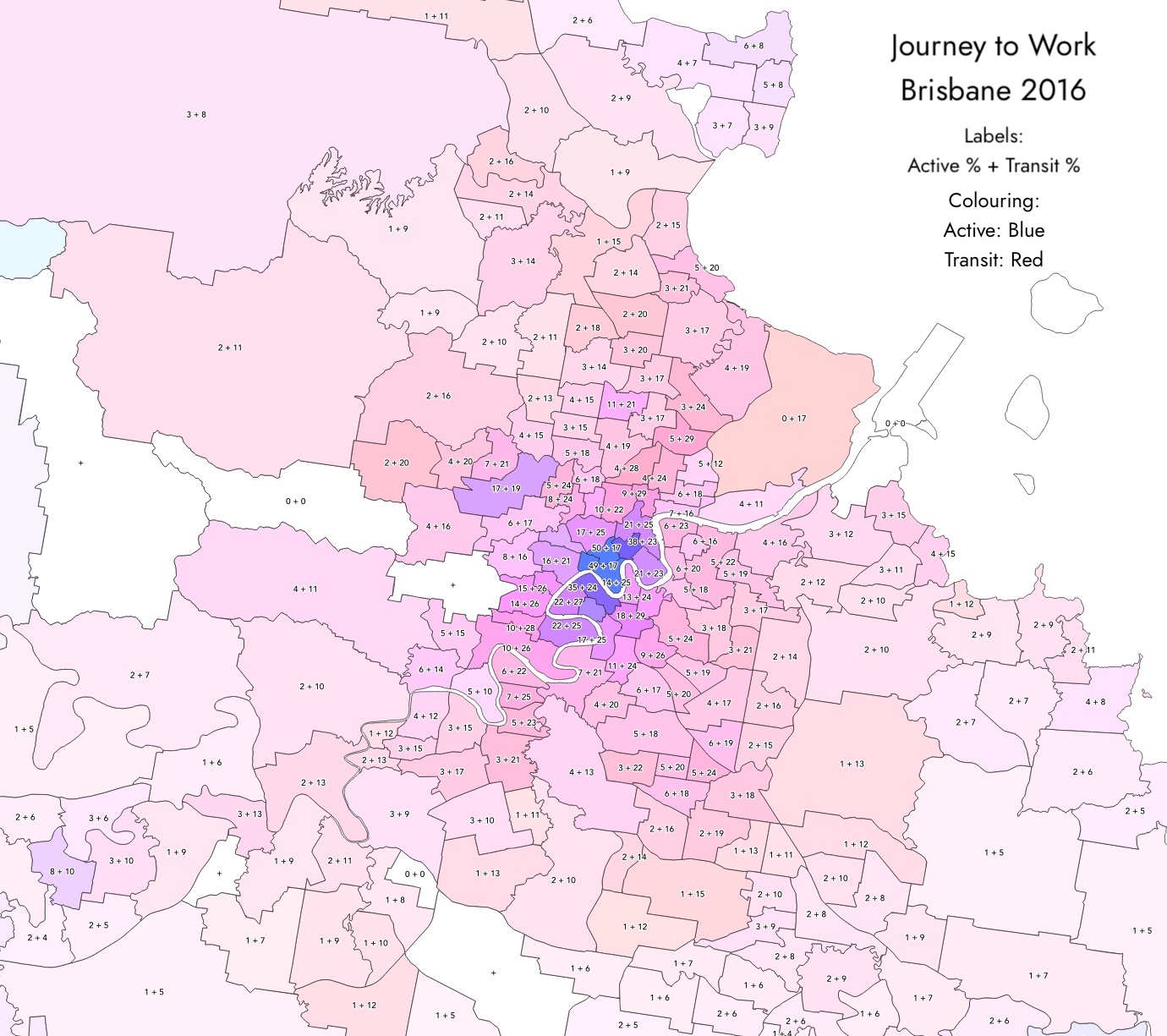
A thread for mode share maps.
Greater Brisbane Mode Share Map (2016) is given below.
A thread for mode share maps.
Greater Brisbane Mode Share Map (2016) is given below.
Key points:
Pretty damning
Members have different philosophical interpretations of the data.
The map naturally raises questions about where investment should best be spent.
For example, should it be spent on constructing an inner-city Paris-style metro, which would mainly serve areas that are already reasonably well served by frequent PT?
Or should it be spent on more services on the existing QR Rail Network and on arterial roads (bus network) that are a bit further out where mode share is much lower?
Something for members to individually reflect on.
I think a lot of this map is simply reflecting where workplaces are.
If you live in the burbs and work in the CBD, chances are you’ll catch PT. If you live in the burbs and your work is 5-10km “sideways” from you with ample free parking… chances are you’ll drive.
At the end of the day we’re living in a very low-density metro area which (for the most part) was built around the car, no surprise we’ll have a lot of car oriented outcomes for a while yet.
PT wins when concentration of demand and intensity of land use are high enough that parking becomes economically infeasible and congestion imposes high delays. Right now that’s clearly the case for the CBD and places like UQ, but it’s substantially less the case for many other parts of the city.
As always, it’s about getting to that high frequency all-day grid!
The Brisbane River means that there are some special opportunities to prioritise PT on trips that a car cannot do well.
Centenary <> Brisbane CBD (because cars must use Moggill Rd / Cornonation Drive) whereas the Ipswich/Springfield line is Priority A
UQ St Lucia <> Brisbane Western Suburbs (because cars have to go around, whereas PT could be direct with a green tunnel under UQ)
Teneriffe <> Bulimba (because cars have to go around, a bridge or busway tunnel to cross the river would give another absolute advantage to PT).
This map shows perfectly the failure of transport investment in SEQ and the scale of change needed not just in active and transport planning or service design but in transport funding.
The scary part is that the investment planning isn’t changing! The potential non-construction of the Gympie Rd Tunnel might be an important change but we still hear a lot of “getting drivers home quicker and safer” from the politicians.
It’s interesting that you can pretty much pick out the rail corridors just from the colours on this map. For example, compare Chelmer, Graceville, and Sherwood to Chapel Hill and Kenmore. Similar socioeconomically, similar density, similar distance from the city, but the former have markedly greater public transport mode shares. There is nothing like a good rail line.