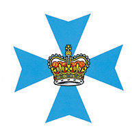

Old logo

My proposed logo
I don’t know why but I really prefer the coat of arms to the old logo. Is there any reason we would need a logo?
Agreed. It’s a government, it doesn’t need to be trendy. It needs to be stable imo.
The LNP changed it back from the Beattie Burger to the coat of arms back in 2012. I doubt that any government will change it from now on.
Your logo has the wrong URI. Needs to be qld.gov.au, as the .gov TLD belongs to the US.
I didn’t and don’t agree with many Newman govt decisions, but the state government logo being the coat of arms plus some text is one of them. It’s fine, no need for change. Government logos should be a little boring.
Perfectly happy with them keeping the coat of arms. The Beattie Burger was definitely showing its age at the time of the change, where the coat of arms has a more timeless quality (and is largely free of politicking - colour changing aside).
I also think the federal gov should change their logo too
I would support them using a real font like a Palatino variant instead of Times New Roman. Otherwise, just like Qld it’s the coat of arms plus “location government”. That’s fine; good even.
I agree, the Commonwealth Government’s use of Times New Roman on their logos is a bit ho-hum.
I quite like the Queensland Government’s use/retention of the Meta typeface in their logo. It has just enough character to feel unique, without being too over the top for Government use. I was a bit bummed though when the use of Meta in Government releases and the like was replaced by the much more generic Noto Sans. It’s not quite Arial bad, and the Noto family does have some benefits due to the sheer number of characters it supports, but visually it is a bit generic all the same.
I kinda like the current QLD government logo/coat of arms. But it would be nice to see QLD use our other symbols more, and people starting to get more familiar with them. When the LNP started changing the colour from maroon to blue, they did sometimes use a koala image, but most Qlders don’t yet seem to know that symbol represents QLD, so just thought we were becoming NSW. Similarly the cooktown orchid and brolga. On the other hand NSW waratah, Tassie Tiger, WA black swan are pretty iconic
Aide from being very generic, the scribbled depiction of the state isn’t very appropriate for use at small sizes like as website favicons. You would lose all the detail.
To be fair, the standard version of the Government Coat of Arms isn’t particularly suitable for use at small sizes either (understandable for something that long predated computers or the internet), but the solid version of the coat of arms works surprisingly well at small sizes. While the main government website (qld.gov.au) uses this solid version, some other Government websites use the standard version and it looks terrible.
If the Government were to move away from the Coat of Arms, I think a good starting point for a new logo but one that represents a continuation, could be a stylised reimagining of the state badge. Keep the Maltese Cross, but replace the detailed crown with a stylised version more akin to the one used by gov.uk .