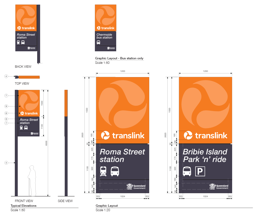
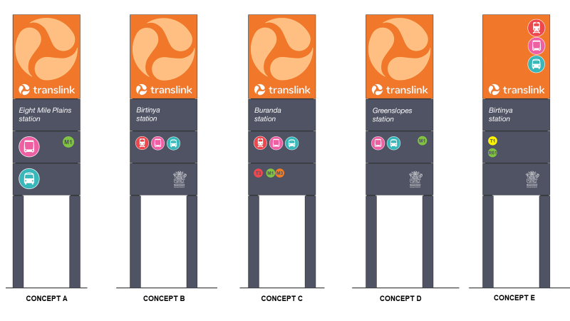
Feel free to post a pic, but I would have thought it complies with the current design manual, which is that station ident signage is in italics except for the QR version used on station platforms only. The external pylon should be the same for everything.
The sign shown above at the Gabba appears to be a new sign on Stanley Street - there is an equivalent on Leopard St near the busway overpass. The old pylon sign for the busway is located at the Main Street / Vulture Street corner at the exit from the inbound platform to the Gabba (and off-hand I can’t remember if it has been updated yet).
The depiction of the word TransLink itself has changed over time - originally rendered as “TRANSLink” in italics and now as “translink” without italics.
Rebranding all vehicles in the fleet would be exorbitantly expensive for something that is really only a cosmetic change. I have no issue with them waiting for fleet turnover.
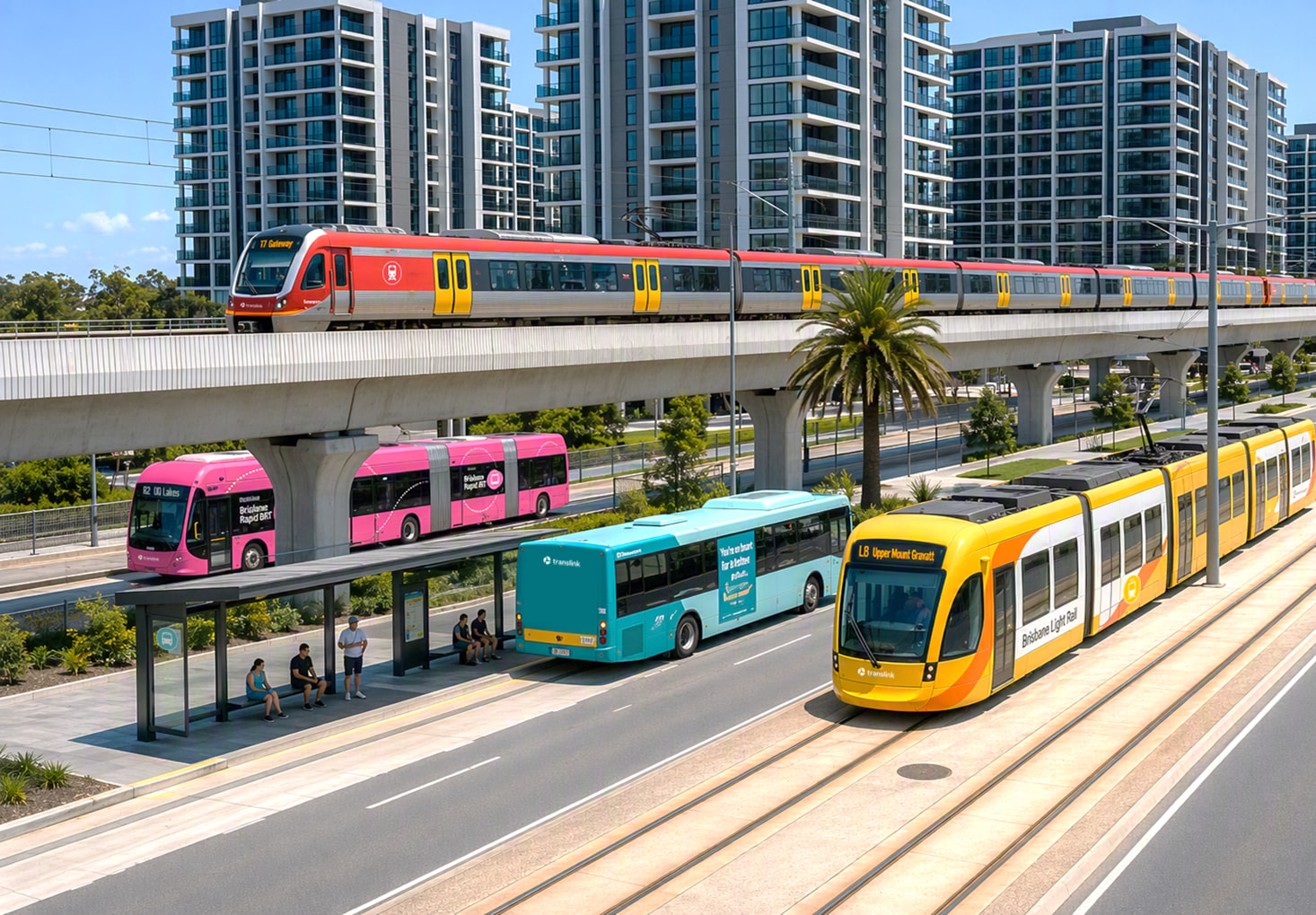
The turquoise and pink is just one of a number of colour schemes utilised by Translink for different purposes. The fleet are turquoise and pink, their website has a pink and purple palette, and the busway network infrastructure has retained the orange and grey palette - likely just to prevent the need to overhaul all the stations unnecessarily. Translink did this pre-rebrand as well, with the blue, orange and green used extensively, but never as part of busway station design.
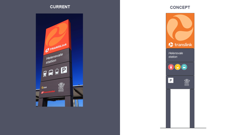
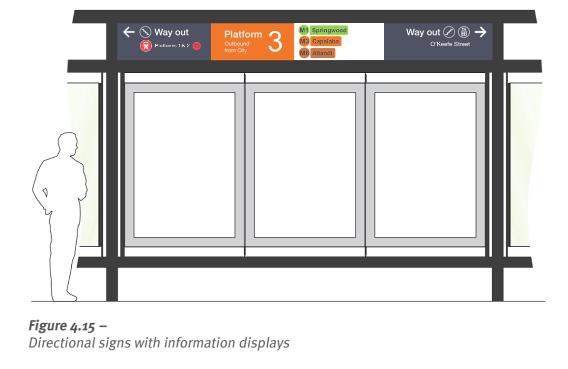
And on the topic of the current busway signage, it looks like this:
I know this is the wrong thread for this… but I had thought about those same things for a while
TL have a pretty timeless brand identity in the Helvetica/orange/grey signage, and yet they change between completely different identities in their corporate/customer service side. Look at TfL, the timeless “Underground” brand is applied to all org identities
In Sydney, I thought it was so cool. In Melbourne, to differentiate between Metro and V-line trains, it is useful. But I think it makes the most sense in Brisbane for one reason, the busways. Any service that is like light rail, like Metro, or pretty much like a tram, like 130/140, is a pretty different service to a local feeder bus.
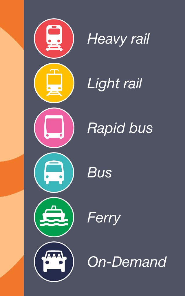
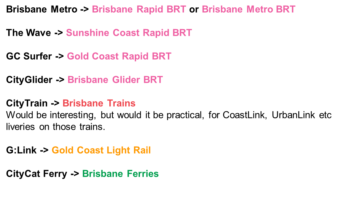
Keeping the turquoise (as buses are becoming this colour) and pink in the mix, I had proposed to colour code these “rapid bus” services pink. See below, obviously different colours again to Sydney/Melbourne, but fit with QLD transport history/current etc
I also think in the future with some main PT authority, I am fully for removing branding like G:Link, Metro/Glider, The Wave, GC Surfer for example. Simple colour coded liveries, some slight design differences and with the service name clearly marked on the side.
I definitely think colours are much more useful than images even including line colours which we already use on the map but don’t use on the network signs themselves
But like why? We already colour everything and represent everything with colours, hell anything Gold Coast related has a colour literally baked into the name
Wasn’t there a study done with Japanese station jingles that people grow attached to particular branding of their stations which helps with transport retention
I wouldn’t say it’s ugly (New York City uses it with pride for a reason), but definitely overused and lacking character for most uses. Hell, Apple stopped using it as well.
I take a look at the G:link logo and I cannot shake the idea that it was deeply inspired by Calvert, the typeface used on the Tyne and Wear Metro.
We could use that one. It’s weighty and quite distinctive.
I don’t think Helvetica is necessarily the issue, in my opinion it is a pretty timeless typeface and continues to be popular for a reason. It is more the application of Helvetica and broader wayfinding aesthetic that looks dated these days (as you stated), particularly with the heavy use of italics.
Firstly, as a graphic designer, I would not call Helvetica ugly at all. Somewhat dated and overused perhaps, and classified as a neo-grotesque typeface, but it’s not ugly.
As for how Helvetica came to be known as that, it wasn’t originally called that - originally it was Neue Haas Grotesk, before being renamed Helvetica by the foundry in 1960 to capitalise on Switzerland’s reputation as a centre of ultra-modern graphic design, coinciding with the ‘Swiss School/Swiss Style’ era - basically the precursor to modern graphics systems as we know them.
I do note that it’s not straight Helvetica (1957) that is being used in the signage manual, but the revised Neue Helvetica/Helvetica Neue (1983), which improved on some of the original’s idiosyncrasies, and expanded the original typeface into a wide ranging family of styles more along the lines of Adrian Frutiger’s Univers.
I recall seeing concept art a long time ago where the orange/grey scheme would gradually have been applied to everything - vehicles, stations and stops Queensland wide (including I think a gas bus with a Surfside decal on the roofline). That would actually have been a good outcome.
As it stands, we can’t even have consistent brand standards on the same bus route. The bus stop designs change the minute you cross the BCC boundary, and on common stretches the livery of the bus changes depending on whose it is. The bus stops issue is arguably TransLink’s fault to begin with as they could (should) have adopted the pre-existing format that was already widespread throughout BCC. Exacerbated by the BCC format originally being used for what was Qconnect and all those stops needing to be replaced.
I think WA wins for sheer standardisation. Every single public urban bus in WA, without exception, is in the same silver/green livery. The ferries and trains wear a similar livery albeit combination of white / green / unfinished stainless steel. The entire system uses the same suite of colours, fonts, icons etc.
I personally like the orange and grey/monument colours for signage. Definitely better than the old maroon colour for QR. I did like some of the signage concepts above, but I can’t see them spending money unnecessarily.
For those of us who haven’t been lucky enough to see inside…
I was near Albert St on Sunday and it was the first time the scale of the awning really hit me. I think we will look back and be glad we went with large entrances to these stations.