Putting these in the Valley will be a good test on just how resilient to punishment this design is.
9 Likes
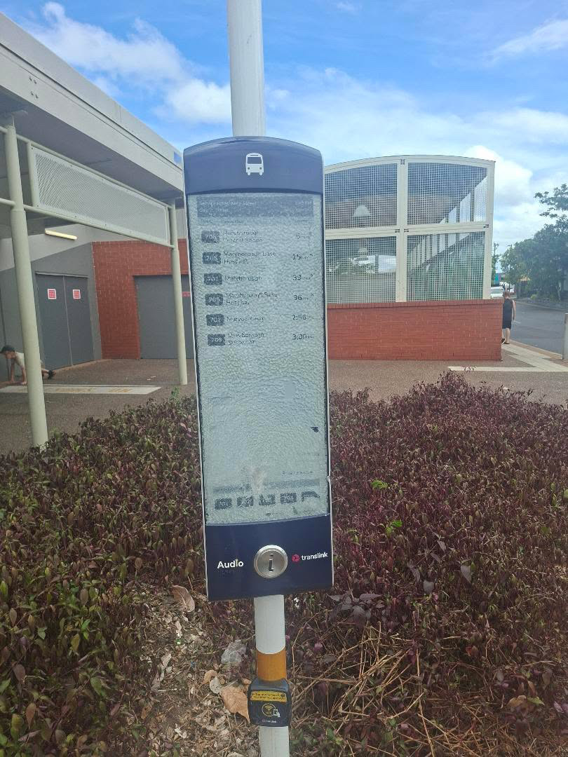
Are the bus stop PIDs still rolling out. If I recall only Cleveland Station in the Redlands here has the new ones (that I know of anyway)
2 Likes
I wish we could settle on a common standard for how these are presented. Some operators orient the next stops from top to bottom, others do it the other way around so you have to read upwards. (My personal preference is top to bottom as that is how people read English.)
3 Likes
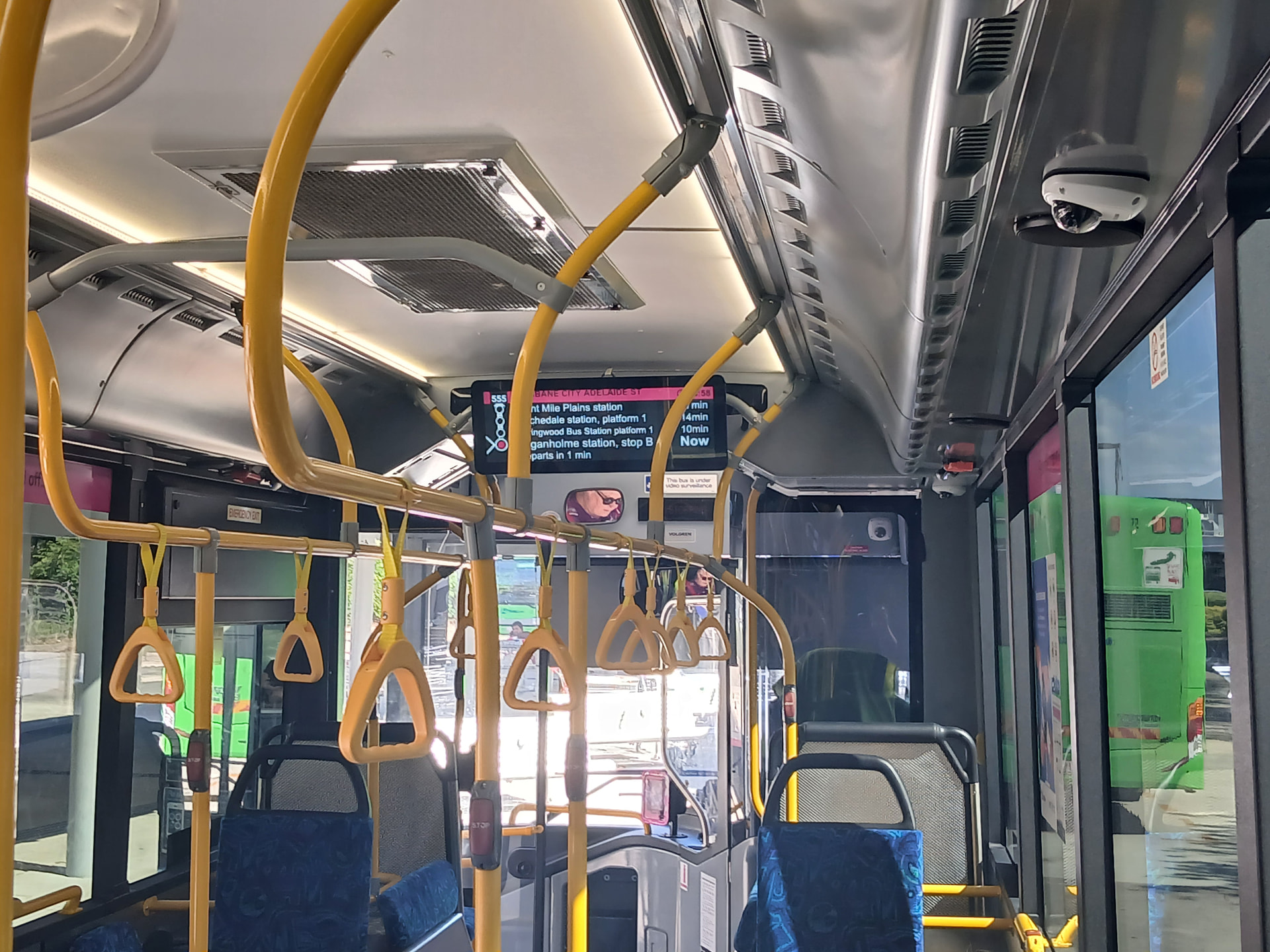
They all should have decent audio as well. The ones installed on BCC buses have reasonable audio and sequence through from top to bottom as I remember. On Clarks and Kinetic buses it starts to get confusing.
1 Like
But you see, BCC will have a hissy fit if they get told what to do
1 Like
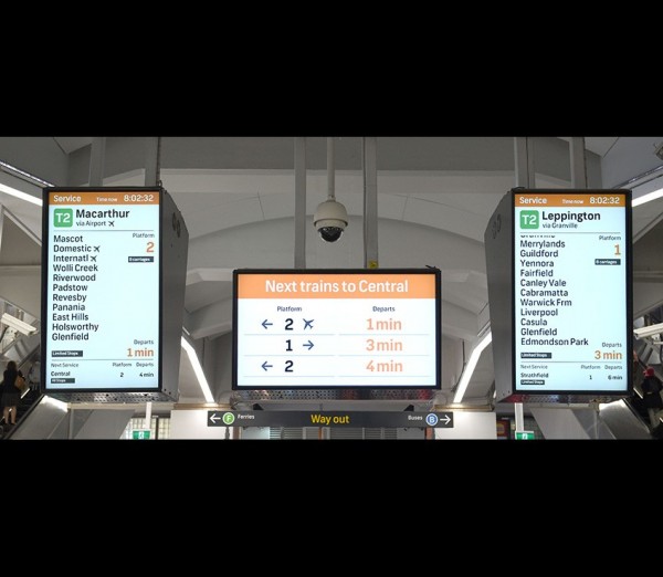
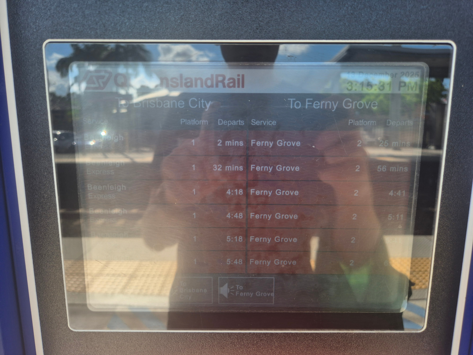
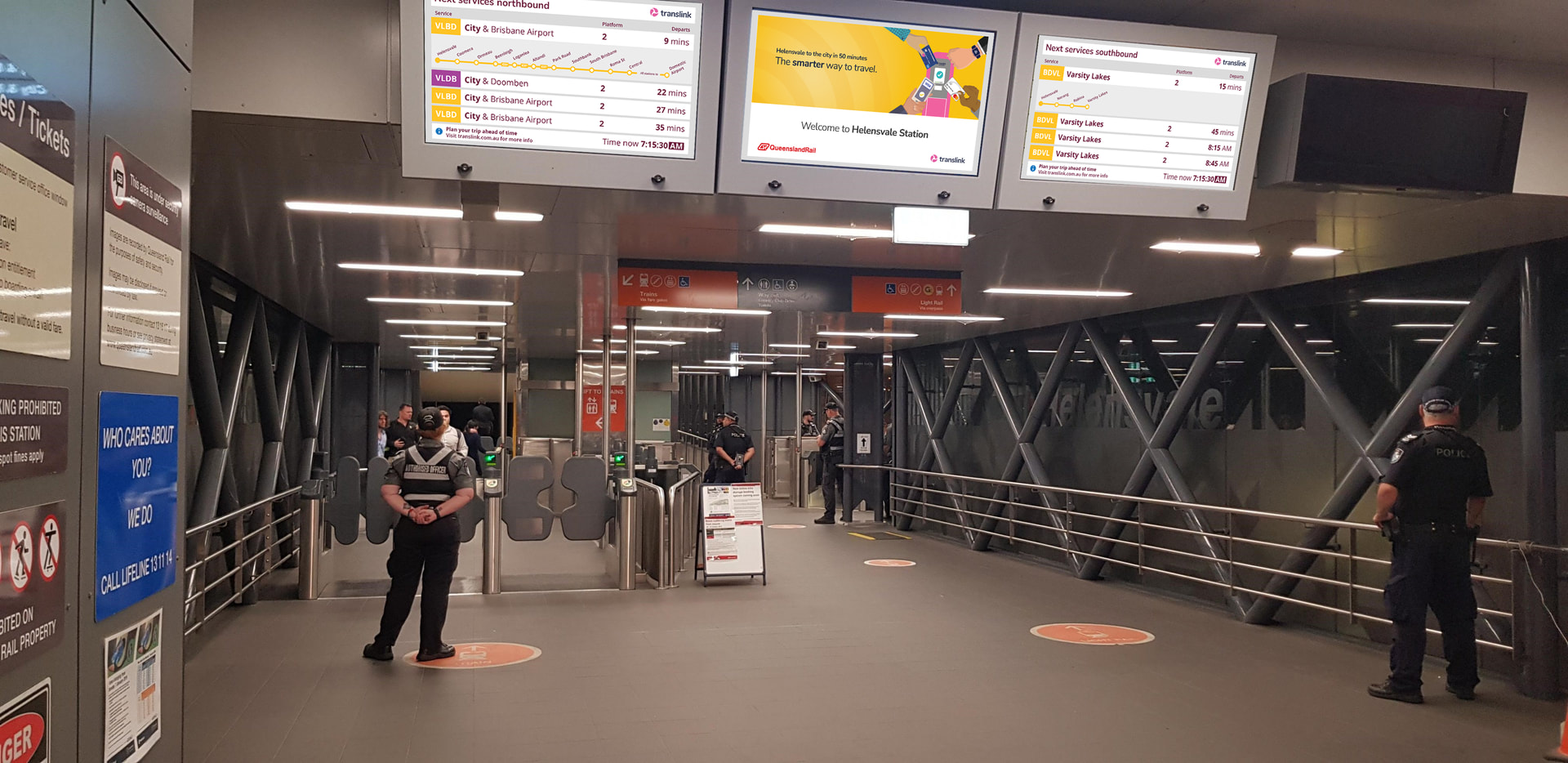
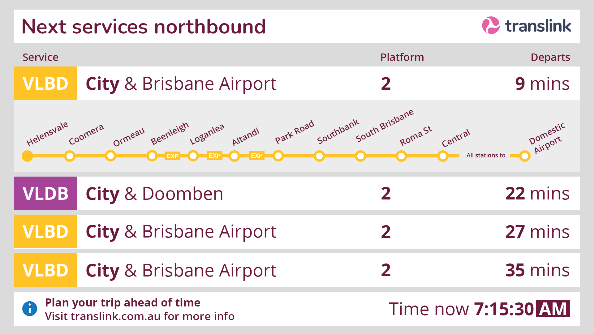
I saw these new screens at Domestic a few weeks ago and it took a while to make sense of what it was telling me. Both because of the density of the text but also the narrow font. I can see the detail would be comfort for visitors who don’t know the network but can recognise the name of their destination on the screen.
However, it looks like the sort of information board in a place where the station is on multiple train lines or with variable stopping patterns, where passengers need to choose the train which goes their direction or stops at their station. If people interpret it that way, they may spend more time scouring the screens than is really warranted (e.g. looking to see if Ferny Grove appears on the screen).
I’ve been thinking about ways we could decrease the confusion of passangers at inner city bus stations so they can get on their way quicker. A big issue I can see at the moment is that it can be very difficult to know if the bus you are trying to catch will take you to another inner-city bus stations (e.g. Wooloongabba to Cultural Centre, or QUT to Southbank).
My idea to improve this pain point is to introduce additional ‘Next Service to Destination’ PIDs which will show the next service passengers can catch towards major destinations. This would be similar to the ‘Next Train to Central’ signs they have in Sydney.
4 Likes
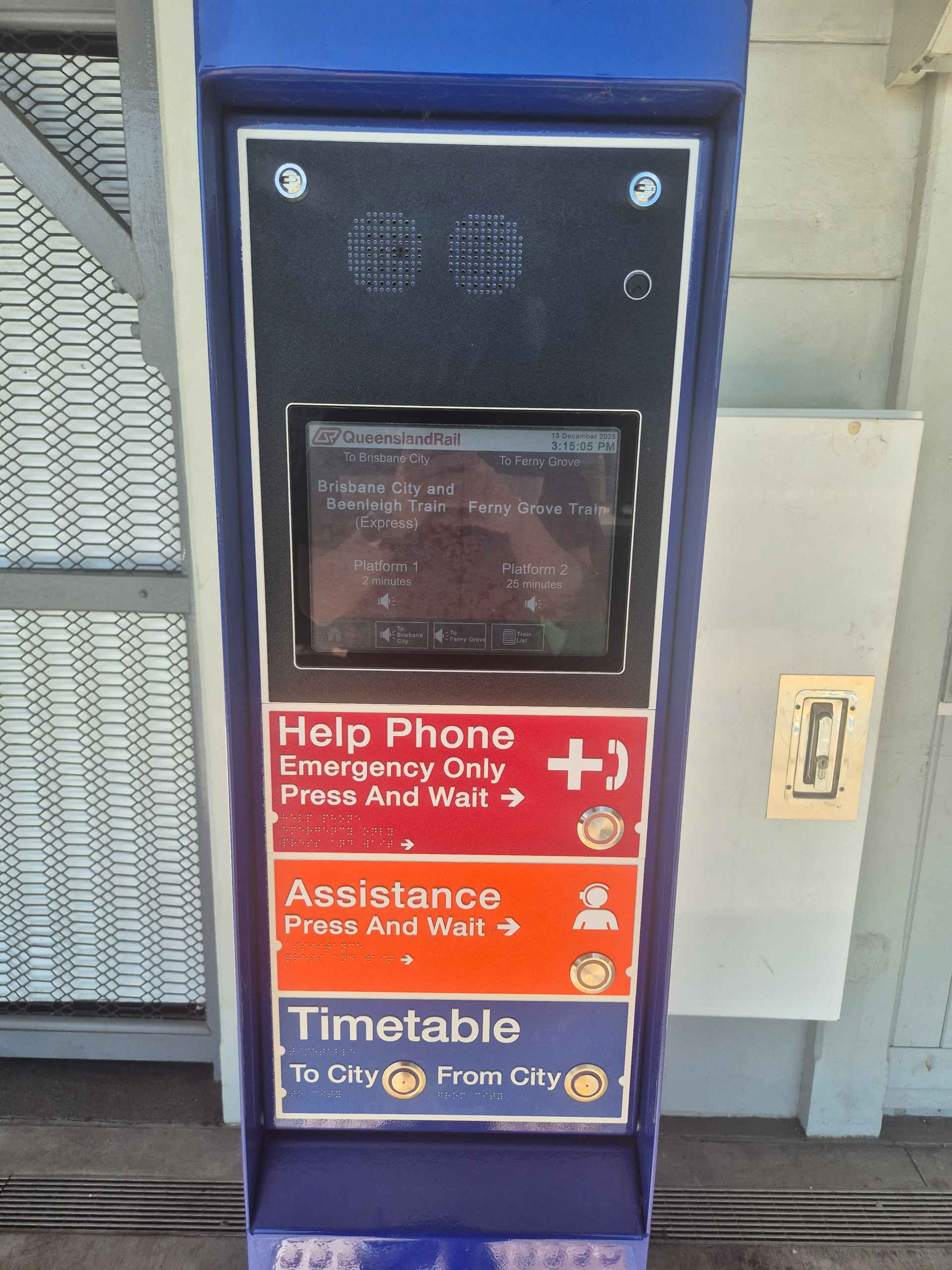
Yeah I noticed the button versions keep disappearing around the network.
Guess this explains why
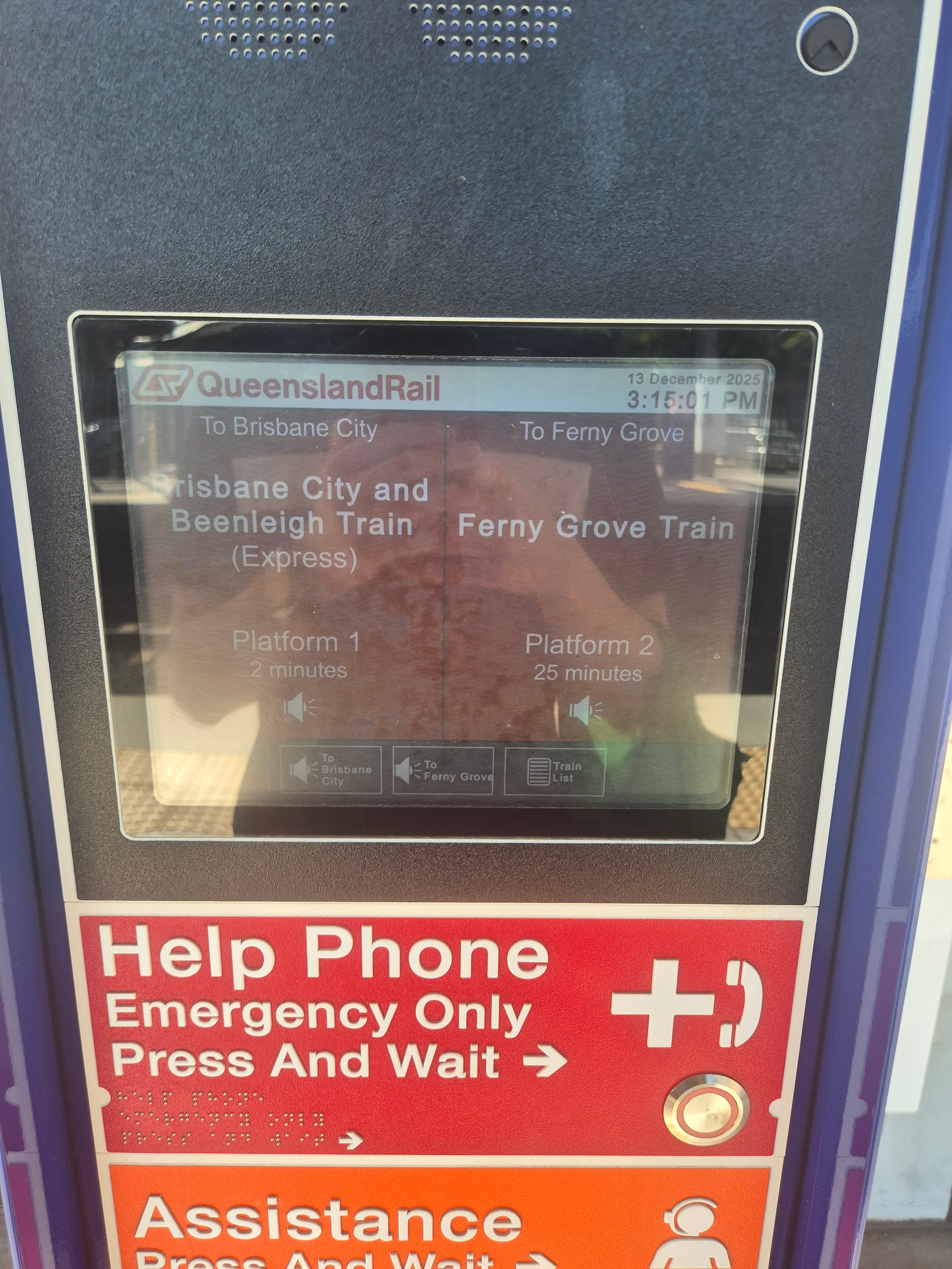
These have been at a handful of stations on the Ferny Line for a while now. I’m not sure what the plan is tbh because there’s a lot with neither atp.
1 Like
They have the ones without the screens on the busway station, just for audible information though.
1 Like
Was the screen smashed? I find deliberate vandalism unacceptable, including graffitti.
glass fully smashed
2 Likes
I’m sure everyone does, except vandals.
As someone who has to visit Maryborough quite regularly for work, I am sadly unsurprised. Good to see the PIDs rolling out regionally though!
Concept for updated PID design, made it a while ago before they updated the SEQ network map. Perhaps could update to make consistent with map at some point….
13 Likes
Looking fresh. It’s well time the PIDs get a refresh; both QR and Translink. Hopefully the CRR tunnels and QTMP rollingstock may kick the proverbial boot up the rear to get a new system rolling out.
1 Like
Quick improvements:
- Add a plane icon to make it very clear that it’s an airport service
- Instead of showing VLBD, VLBR and so on display the scheduled departure time on the coloured rectangles
- South Bank. Two words! Melbourne is the weird one that uses it as one word.
- Maybe adding temperature would be a nice to add on the bottom info section, but again, nice to have
Great work.
3 Likes